Creating RDot
For the first time in 2020, I took a couple of weeks off to recharge my batteries a bit. As I’m wont to do sitting at home in this lovely weather, I picked up three side projects all of which are chugging along nicely.
This one I probably cherish the most and didn’t expect to finish, at all. But I did. I created a typeface pretty similar to my own handwriting 😱. You’re reading this particular post in RDot. Just covering a few basics
Why create a typeface?
- Because I can 💪
- I wanted to write online the way I write in a notebook and even though I have a horrendous handwriting as is clearly evident, it feels like me.
How did I do this?
Step 1. Understand the anatomy of a typeface

Picture credit: https://www.metaflop.com/modulator
I have been following typography for a while so I already understood basic terminology like kerning and ligatures. What I didn’t understand, I read and tinkered with tools such as the above one to individually move configurations and understand them better
Step 2: Add salt to taste
It is a visual artform and I used 3 approaches in progression to keep chipping away till I was happy
- Using the Metaflop modulator, I used the “Bespoke” font as a base version and tweaked it to match my handwriting over 2-3 hours. It’s a bit of trial and error but worth the effort. The flexibility here to tweak individual letters the way you wish is limited but it’s a great first step. Then I exported this version as an open type font (.otf). An alternative to this approach could just be to borrow an open source font from Google’s excellent font library.
- Importing this open type font into Glyphr Studio allowed me to add specific letter elements, ligatures and kernings. For instance: “R” has a circular element which gives the font its name (RDot) and ligatures like “th”. Glyphr was way more time consuming and I loved the ability to test drive all the changes I was making here as I was tweaking. Again exported this output as .otf
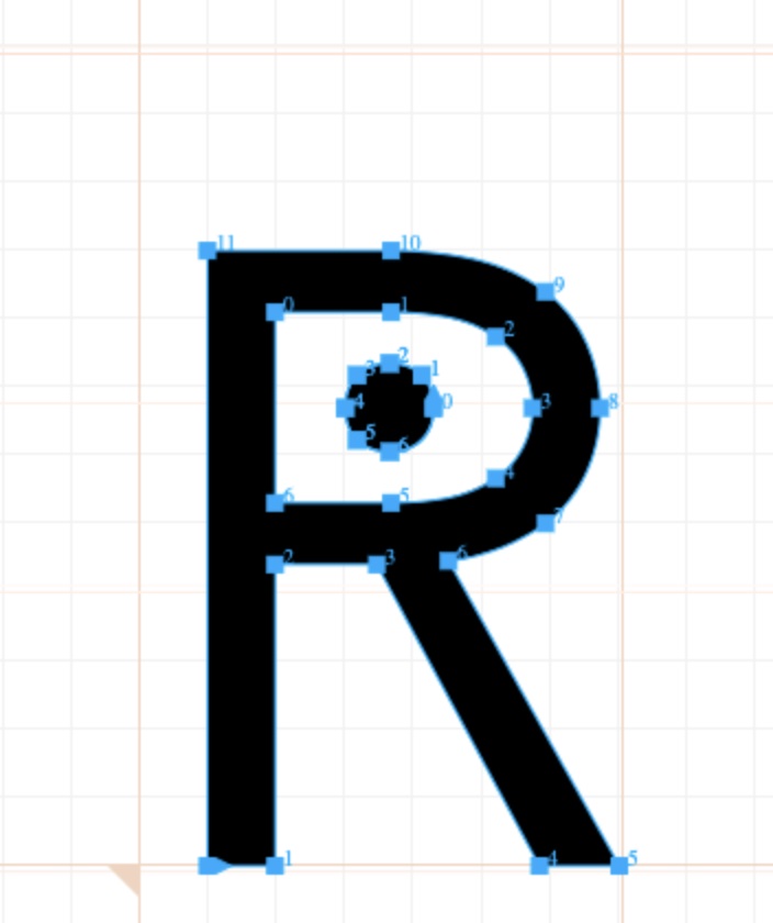
exact Glyph for r
- Tweak individual glyphs using Font Forge to get the exact shape you’re after. Glyphr is web based and has its limitations on Bezier curves and moving points around neatly. I absolutely loved the way “w” shows up in Raleway as a font and modified individual points to get it exactly the way I wanted it to. Super happy with the way that turned out 🥰
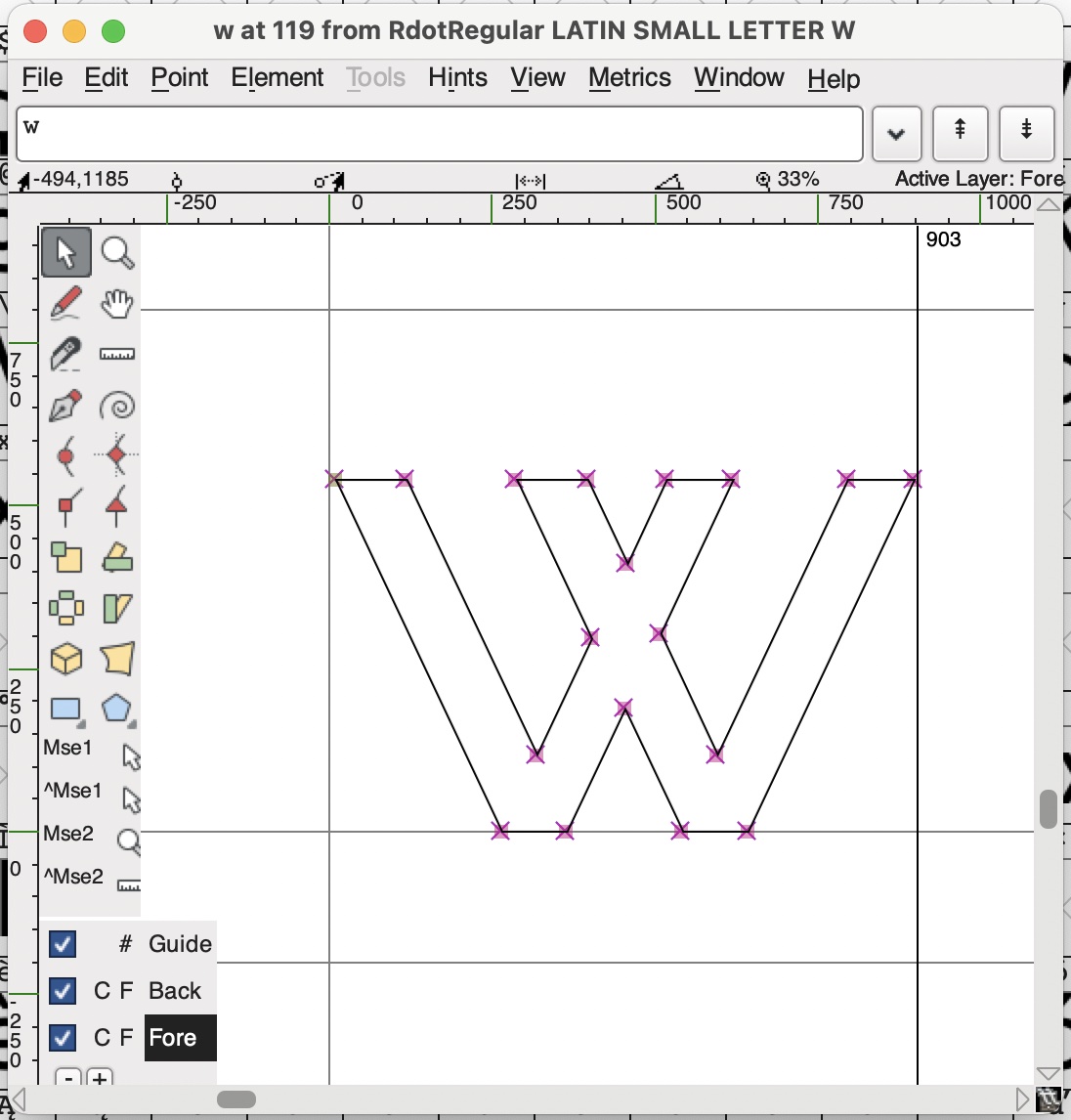
exact Glyph for w
Step 3: Convert the .otf to web font type .woff
There are multiple online tools for doing this. I used this one. The next step was quite straightforward. I added that .woff to this blog’s css and Voila! The only basic element to change was that my handwriting is pretty tall (and so is this font). I needed to tweak other margins / line heights to make sure that the change from Helvetica doesn’t seem bizzare.
I wish I could just post the .otf here for anyone to experiment but the reality is that the type is deeply flawed! It just has latin glyphs and just one size: regular. In this controlled environment, it might look ok but in a slightly different setup, it likely won’t. Maybe I’ll extend it later but pretty happy that I could get this out of the door and I wish this is the first of many type experiments I eventually run.
← Home